As more and more companies and products enter the world of mobile applications, adaptation and innovation is necessary in order to successfully position branding in the digital world.
In this article, we will discuss four good practices as well as consider several examples of the correct use of branding in mobile applications. For additional tips on this topic, please see our post entitled “Essential Branding Rules for Mobile Apps in 2020”
1. Effective Color Application
In branding, the selection of an effective color palette is an essential factor in the nonverbal communication of a brand. The choice of color creates an impact, generates emotional connections with users, and communicates the values and essence of a brand. Color also helps users recognize and remember a brand more easily.
Applying a branding color palette in mobile applications is a simple but effective way of communicating to and reminding users what application they are using.
One example of effective color application is found in the Microsoft Office Suite. Each app features a color from the branding palette, and subtle touches of each color assist the UI. The UX is enhanced by these colors, as the use of various tones from the palette result in the family of applications appearing as and feeling like a cohesive package.
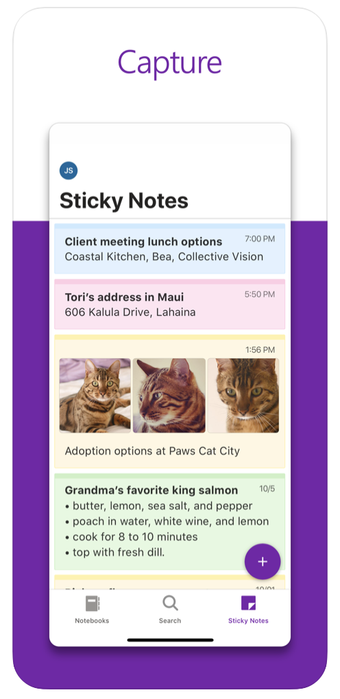
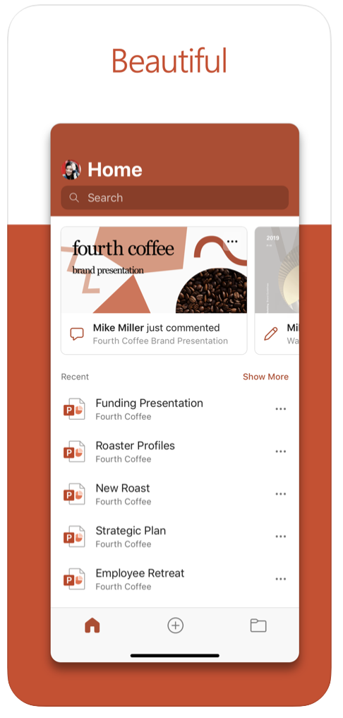
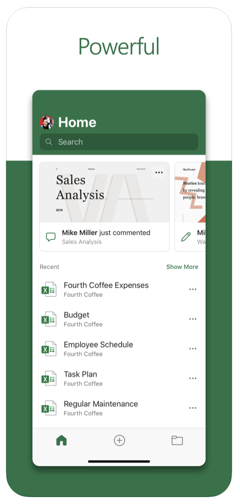
Images from App Store
Example: Microsoft Office Suite: Teams, Outlook, One Note, Word, Excel, etc
2. Powerful App Icon
The app icon is one of the most sensitive points in the design of a digital brand. Sometimes the icon is the brand logo; sometimes the icon alludes to a particular product within the brand. Other areas within the app (such as the splash screen, for example) will also use the app icon.
The app icon must creatively and simply communicate the essence of the application’s user experience. “What is it?” is the central question designers must ask themselves before delving into the design of an app icon.“
Remember: The app icon is the first interaction a user has with an application. It is the first thing the user sees in the search results before choosing to download an app.
If an existing logo is to be used as an app icon, it is essential to verify that the logo complies with requirements such as readability, composition, etc. (Look for a future post entitled “How to Design a Good App Icon.”)
An excellent example of a brand with an effective app icon is Airbnb. The icon plays with the brand’s phonetics using the letter “A” and then complements it with a very important UX factor—the location of a host.

Image from App Store
Example: Airbnb
3. Appropriate Logo Use
Clients often want to place their logos everywhere—almost every designer has encountered this dilemma. The world of mobile applications can create the feeling of an “infinite canvas,” and that often gives clients the idea that the canvas cannot be empty and should be filled and used as much as possible. The logo is an element commonly—and wrongly—used for this filling.
It is essential that designers propose using logos and isotypes (picture language) in creative ways without interfering with the UX of the application. Although it isn’t necessary to place a logo more than once for users to identify which application they are interacting with, there are creative ways in which to implement further use.
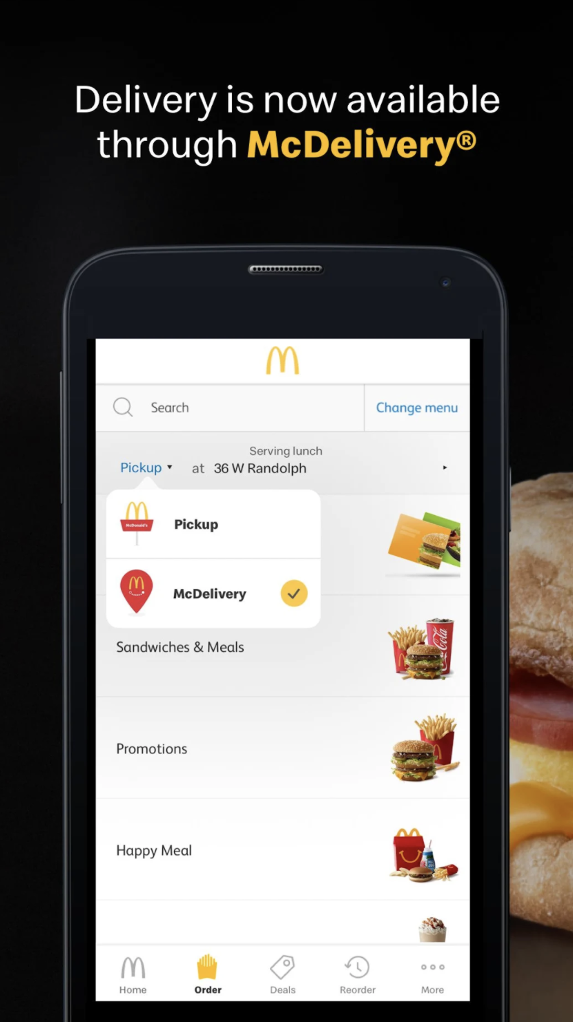
For example, sales applications such as Target and McDonald’s use elements of their logos to translate the traditional face-to-face experience into a familiar-feeling digital experience. The graphics of bags, carts, packaging, catalogs, etc. offer opportunities to keep the brand alive without hindering the user experience.
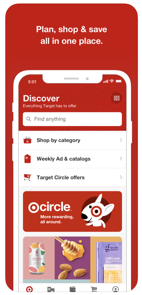
Images from App Store and PlayStore
Example: Target App, McDonald’s
4. Consistent Graphics
Ensuring consistency in app graphics and illustration styles is another way to reaffirm branding. In order to support an application, illustrations and graphics must capture the brand’s essence by maintaining a similar style in elements such as shapes, strokes, stroke styles, stroke weights, colors, compositions, backgrounds, and language.
The use of “language” refers to the more complex attributes of graphics: what they are designed to communicate and the simplicity with which they deliver the idea. For example, conveying the concept of the word “Write” can be as simple or complex as desired, such as the simple graphic of a pencil or the more complex graphic of an ink fountain pen with a scroll next to it. The chosen language is then applied throughout the application, from utility icons to intricate illustrations. Following are two examples.
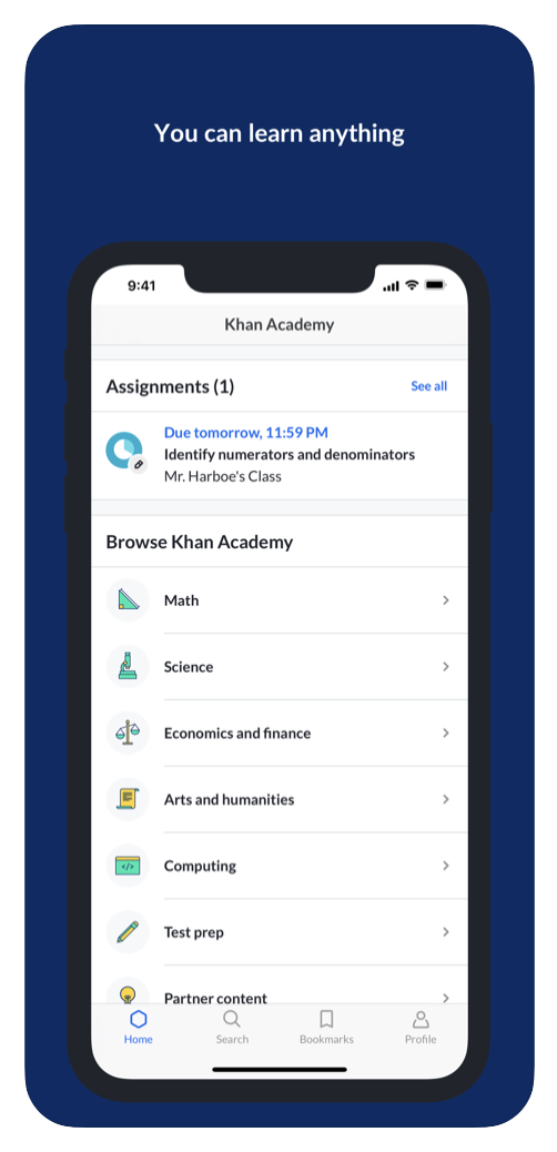
First, Khan Academy strengthens its category icons and gives them more personality by placing them in the brand’s primary color, thus maintaining a coherent composition and language in all categories.
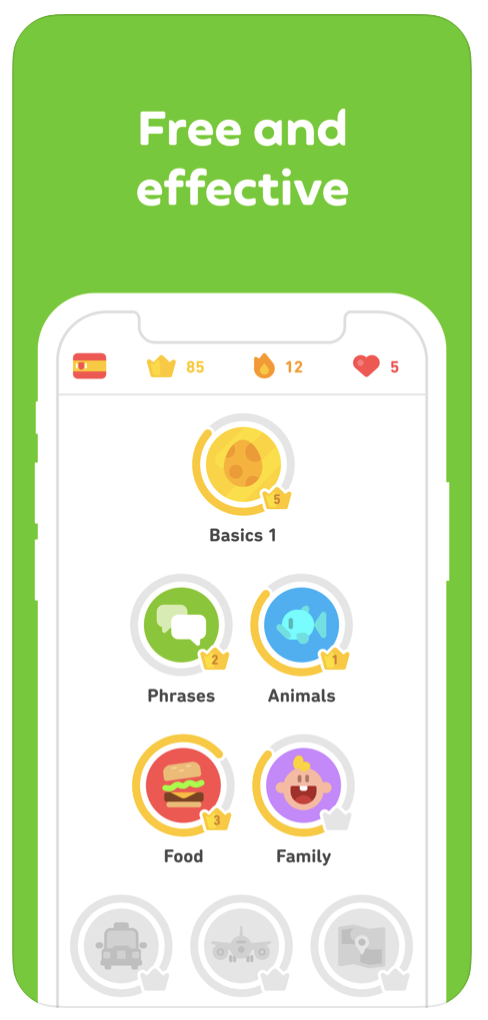
Secondly, in the case of Duolingo, the brand is more playful, lending itself to the creation of icons and graphics with different colors and shapes. The brand still maintains a consistent language, however, by using the same style of illustration, remaining faithful to the brand’s already-familiar communication.
Images from App Store
Example: Khan Academy, Duolingo


