


Table of Content
- Introduction to Design Principles
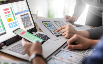
- Design Principles and Digital Interfaces
- Seven Principles of Design
- A Real-Life Example
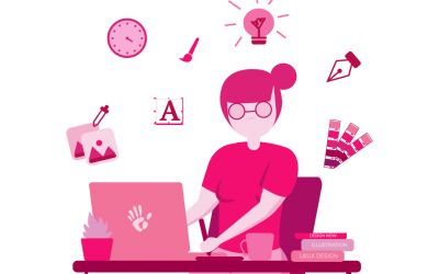
Introduction to Design Principles
Design principles are a set of “rules” established to serve as aesthetic guidance throughout the design process. These principles apply to product design, graphic design, industrial design, interior design, architectural design, and more. Design principles help to make objects or graphics not only more attractive but also more functional.
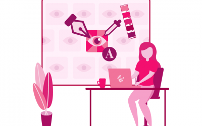
Design Principles and Digital Interfaces
In this new era of ever-changing technology, design principles also apply to digital interfaces such as mobile and web apps as well as to products that require digital interfaces, such as residential or commercial appliances, smart home devices, etc.
Seven Principles of Design
1. Hierarchy
The principle of hierarchy is a tough one to explain since it is a very abstract concept and can be applied in different ways.
So, what does hierarchy mean? When we think of hierarchy, we can relate it to the idea of an organization in which the chain of command follows a specific order. That order automatically means that some subjects/objects are above others for a particular purpose.
From a design perspective, hierarchy works the same way. When we design, there will be particular objects or texts that will gain more attention from users. (This concept is shared with another design principle: Emphasis.)
When we consider hierarchy on digital interfaces, we can see it clearly in already-established layouts for mobile apps and websites. A crucial part—if not the most essential part—of the UX in a digital interface is the navigation. Achieving functional navigation is necessary for fair usage of a product or interface. That’s why navigation is found at the top of screens and is always present for the user to access other sections of the app.
Thus, in considering the concept of hierarchy, navigation menus and bars are always placed at the top. All other information naturally lies beneath the navigation tools.
Another way to exemplify hierarchy is to consider all the content that is placed on a digital interface. Content planning in design is an excellent way to bring order to the screens. The result of content planning gives designers a hierarchy of information and actions—a clear understanding that some elements need to stand out. From a UI perspective, it is common to have the most-used activities always on top in the menus or in separate icons so users can easily access these features.
2. Balance
We can define the principle of balance as an even distribution of elements. If we think of the phrase “Find your balance,” we think of finding the place in our lives where everything feels right. The same thing happens in design. However, bringing balance to a poster, a website, or a room, for example, is often not an easy task.
From a UX point of view, balance means presenting the right amount of information and actionable items at the right time. It also means creating smooth paths for users to perform specific actions. It’s hard to define the right balance of activities for users—it’s much easier to find examples where we know we haven’t achieved the appropriate balance.
For example, let’s consider a setup wizard for a smart device. We know we need to present the user with a series of actions to perform in order for the device to be paired…actions such as device discovery, setup Wi-Fi, setup device settings or preferences, name the device, etc.
The design question is: Do we present all the actions at the same time? Do we split them up? How many steps will be required? Will the user think there are too many steps?
This is where we need to find a balance between actions and information.
From a UI perspective, when we apply the concept of balance to a screen, we’re talking about having the right amount of content, graphics, fonts, colors, etc. This “right amount” is the level that we perceive as aesthetically pleasing for the user. Achieving balance in UI also allows a positive UX from the standpoint of readability and usability. When designers place buttons and content in the right place, users will be much more likely to understand the information presented and perform the desired actions.
3. Contrast
We can define contrast as differentiating elements from each other. In the design process, specifically, contrast means taking action to make certain objects, graphics, or text stand out from the background or from the rest of the items.
From a UI/UX point of view, contrast is easy to define and to apply. First and foremost, contrast means that the content you present must be readable. Secondly, the background and other design objects need to be differentiated from each other.
Contrast is a vital component of readability, especially with text. (The other readability factor is font size.) Presenting readable information is a significant step toward achieving a positive user experience.
When thinking of contrast in objects and fonts, designers also need to consider accessibility. For example, there may be occasions in which you design for users who are colorblind. In that case, color will not help in contrasting a text and a background. Alternatively, you can design in such a way that color is not the only element creating contrast in the design. Depending on the circumstances, shapes, graphics, and enhancements can also help you achieve distinction.
The design principle of contrast can be applied oppositely as well, meaning an object or text is given less contrast for a specific purpose. A typical example of this is when buttons or action items are presented as “disabled.” Some of the opacity is taken away from these objects so they will blend more with the background. The user can then interpret that as “this item is not available right now” (as opposed to an item with more contrast being “available”).
4. Emphasis
From a UI/UX point of view, the design principle of emphasis plays a significant role in an object’s layout.
From various studies, designers know that screens/interfaces have certain hot spots that attract the user’s attention. For example, we know that users with a Western education will start to read at the top left, continuing horizontally until reaching the bottom right. We also know that as we hold a screen, the most accessible place to touch with one hand is the bottom area, since our fingers are closer to the bottom than the top. With this information, designers can emphasize objects that drive action by placing them at the bottom of the screen; that way, a user will read from the top but act at the bottom.
The concept of emphasis means making the best design decisions about where and how to drive the user’s attention for a specific purpose. Deciding where to place objects based on functionality is a UX-driven decision, yet it can also be helpful from a UI perspective.
As designers, we have different tools and options (such as font type, color, object size, etc.) that we can use to enhance certain design elements. Making proper use of these tools helps us drive the user’s attention to individual graphics or information.
In addition, to enhance particular objects, the use of emphasis may also draw on other design principles, such as contrast, breaking repetition, content hierarchy, etc.
5. Repetition
What is repetition? A universal definition indicates that repetition refers to the act of presenting a recurring object or situation. From a design perspective, we can say that repetition is the principle that enhances and unifies the design.
Repetition is a crucial aspect to consider from both a UI and UX perspective.
When thinking of user interface, designers need to plan with a powerful thought in mind: consistency. So, how does consistency relate to repetition? Well, consistency means presenting a set of information and/or graphics in exactly the same way throughout an entire mobile app or website.
Also, consider an example from a UX point of view. Let’s say you’re designing a mobile app that involves a wizard. Make sure to place information, buttons, instructions, and graphics so that users know when they’re on the wizard versus when they’ve completed the process and have left the wizard.
Another example of the importance of consistency relates to a screen’s layout. As more and more users are accustomed to dealing with digital interfaces, designers have adopted specific formats as universal—such as placing status and navigation bars at the top, in particular. In the navigation bar, we often find the title of the screen and a back button. Over time, that back button has been so consistently and repeatedly used in digital interfaces that now it’s more like a rule than an option.
In general, it’s important for designers to recognize that consistency—the repetition of graphics, behaviors, and layouts—helps us create designs that users can already relate to, based on their previous experiences.
A final thought about repetition: It should be mentioned that repetition and enhancement are design principles that, by definition, seem to be contradictory; however, they are, in fact, complementary. Without repetition and consistency, designers would be unable to define an object as enhanced. We must first establish a pattern in behavior and graphics. Then, when required, we can break away from that pattern with a design (an enhancement) that stands out for a specific purpose.
6. White Space
The design principle of white space is probably the most controversial from the perspective of a non-designer. White space does not refer to a literal white-colored space. It refers to space left empty for specific purposes. From a design perspective, white space helps us bring a feeling of “breathing” to a design, like a visual rest from objects and graphics. White space also allows us to create balanced compositions for purposes of better reading.
So, why is white space controversial? Well, I cannot lie. As designers, we’ve probably all encountered customers or users with no design background who meet a white-spaced design that they feel is dull or incomplete—and they couldn’t be more wrong.
As designers, we need to educate our customers about the benefits of white space, helping them understand white space as an enhancement that assists us in directing a user’s attention to particular objects with a specific purpose.
In the design process, we must first consider what we want to communicate to users in a specific scenario/screen; then, we must think about placing the object or objects we wish to enhance. If, in the end, the user achieves the screen’s purpose, there is no need to populate the screen with more graphics just because it “feels empty.”
Designers often encounter situations in which a significant amount of information is required and/or mandatory. In those cases, we need to ask: Is seeing all this information at once really helping the user? Can the user actually read and correlate all this information at one time?
As we plan our designs, it’s essential that we test what we’re designing so we can learn what best helps users to achieve a specific task. Yes, perhaps all the information is relevant and helpful, but putting it all on the same screen may confuse and overwhelm users. Designers often need to create a practical way to hide some information while also giving users an easy way to access it when they choose to, as opposed to having it all in one place at the same time.
From a UI perspective, we know that crowded interfaces lead to bad user experiences. Having too many tools and/or too many action points with no order or purpose can disorient users and prevent them from moving toward or achieving the goal.
All that said, white space can also be presented in smaller amounts, depending on the situation.
7. Movement
Movement means to go or follow a specific direction, starting in one place and ending in another. From a design perspective, the principle of movement can mean different things.
As an example, let’s think of a house. In most house designs, the distribution of rooms is planned so the user can interact with the space organically. Now let’s picture a particular house: After opening the front door, we see a bathroom as an open space; then, we see another entrance with a patio and a terrace. Next, there is a bedroom. Beside the bedroom, there is a door; behind the door, we find some stairs that lead to a kitchen and some other stairs that lead to a living room and a laundry room.
Now, I know what you’re thinking—this house makes no sense! The personal areas are not private, and the common areas are too far away. The person who lives in this house will have to behave differently than expected in order to interact with these spaces. And because it’s not how a person would normally interact with the various rooms in a house, we automatically feel that it’s awkward and not right.
The same concepts apply in design. There will be a desired (and most comfortable) way planned for the user to interact with the system or digital interface.
From a UX perspective, designers plan for screens to be read in a specific way to help users achieve a task or understand certain information. To accomplish this, we use various tools. We have screen titles; we have parameter labels that are different from reading labels; or we use editable parameters that have a different interface than read-only parameters. The way users interact with all these variables defines the movement we seek in our designs.
Let’s use Google Search as an example. What do we see? How do we interact? Is the search button first and then the search bar? No. The first thing users interact with is the search bar, and then they see a button to click to start the search. There is an order. There is a right way to read the screen.
A Real-Life Example
Now that we’ve discussed several design principles—hierarchy, balance, contrast, emphasis, repetition, white space, and movement—let’s consider an example in which we use several design principles together.
Case:
We’re designing a mobile app notification that must include a title, a description, an icon or image, the date, and the time.
In addition, the user needs a way to delete the notification and another way to save or store it.
We must also consider that we’ll be presenting the user with a list of similar notifications. This means there will be many notifications with somewhat similar information.
Problem:
We need to give users the right information without creating a crowded screen or presenting too many notifications; otherwise, they may not read all the text. Also, users need to be able to identify useful information quickly.
Design:
As designers, we immediately apply design principles to bring order to the necessary/required information and achieve a functional design.
Emphasis:
First, put the title in a bolder and larger font to drive attention. If the title contains something meaningful for users to focus on, they may read the description.
Drive focus toward a notification that needs immediate attention through the use of color, images, or symbols.
Hierarchy and Movement:
What’s the first thing we want the user to read? The second? The third?
Answer: We want users to read the title first, then the description, and lastly, the date and time. The design must convey this order.
Repetition:
It is essential that information be placed in exactly the same manner in all notifications. Consistently seeing the same layout helps users know what to expect and what to read.


0 Comments