Table of Content
Views
Views are a type of controller that allows the user to choose from specific actions to trigger behaviors.
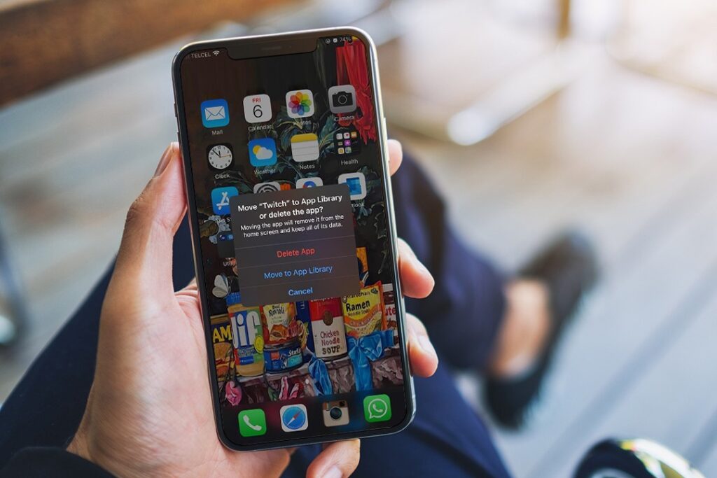
Action Sheets: These are components that present the user with two or more choices from a specific scenario. The difference with this picker is that the options offered in action sheets are exactly what the name proposes: actions, meaning that the user’s choice will trigger a specific operation. iOS mobile apps use this type of component. (The most similar component in Material Design is “Sheet: bottom.”) One thing to consider in this type of component is the number of options that are provided to the user. In their Developer Guidelines, Apple recommends against the use of a scrolling behavior with this component.
Activity Views: This component serves to expose the user to external apps in a menu with options to share or save files or documents. The options presented depend on what apps the user has installed in the device.
Apple Developer Guidelines have already defined the UI and behavior of these types of components.
Controllers
Controllers are primarily used to set up or change specific parameters. As the name indicates, the purpose is to control variations and states.
Sliders: These controllers feature a line (could be segmented or not) representing a range for a parameter. The beginning of the segment is the minimum and the end is the maximum, meaning the user can only control the quantity between the limits of the range offered. A line will usually feature an object or figure representing the slider’s current state (the current quantity selected). This object can be moved throughout the range to modify the parameter. This type of component is most often used in simple behaviors like adjusting temperature or volume.
There are multiple considerations with the use of this component:
- Range: Designers must be careful that the range is not too big, so the granularity is not too small. For example, in considering a scale that goes from 0 to 30 in a mobile portrait space, the user would not have trouble setting up the parameter. With a range from 0 to 500 in the same space, however, the user may encounter difficulties defining specific quantities because of the granularity. The user will struggle to get a particular result, whether moving a cursor or tapping the slider.
- Size: Always consider that the slider’s functionality depends primarily on the object used to make a selection within the range. These objects need to be large enough for the user to tap and adjust.
- Current State: Some sliders give real-time feedback while the user changes the state of the slider. This behavior is useful, but designers need to carefully consider how the current state plays its part in the design.
Steppers: These are button-shaped components that allow users to change quantity in parameters by increasing or decreasing the values. Simple and familiar, this behavior/functionality is found in electronics, temperature controllers, and other common uses. This type of component is used regularly in website designs and mobile app designs, both Android and iOS.
Switches: These components graphically represent a physical switch, allowing users to choose between enabling or disabling a parameter. Note: Designers should try not to use switches between two options that do not illustrate opposite concepts. For example, consider a user who needs to choose between the colors red and blue. If this choice is represented with a switch, it is not clear that the opposite side is the other color, since red and blue are not antonyms. To resolve this concern, designers can choose to use a switch indicating each color option, and when the user enables one, the other is disabled. (Alternatively, a single choice component could be used effectively for this type of decision.)
Pop-ups, Dialogs, and Alerts
Popups and alerts are types of views that often appear in digital interfaces to grab the user’s attention and induce action.
Pop-ups: These are floating views with different objectives, depending on user behavior. Examples include:
- Pop-up Menus: (Described in the Menus section)
- Pop-up Dialogs: These serve to deliver a message to the user; the message can include actions. Popup dialogs need to be clear and explicative regarding what the user needs to know or perform before dismissing the popup.
Alerts/Warnings: Alerts are used to let the user know that something wrong is happening during the process and that direct action is needed. Alerts/Warnings can be classified by severity so the user can understand the message and the urgency to take action.
Toasts: Also called snack bars or banners, toasts are limited-time messages that allow the user to know that an action was already performed, is being performed, or is waiting to be fulfilled. Toasts are different than popup dialogs in that toasts only appears for a limited time, and they are not blockers, meaning the user can continue with the tasks on the screen without the need to dismiss the toast.
Bars
Serving a number of different purposes, bars consist of spaces featuring icons, buttons, and/or labels. They often appear on the top or bottom of mobile apps.
Navigation Bars: Found at the top of the screen, navigation bars serve as a way to go back to a previous screen as well as to let the user know what screen they are currently on. Similarly, a NavBar provides more vertical navigation, allowing users to drill down or up to another level.
Tab Bars: Found at the bottom of the screen, tab bars are unique in that they are composed primarily of icons. The tab bar offers horizontal navigation (changing from one screen to another), while giving the user the illusion of being on the same screen and just changing views.
Search Bars: Differing from both navigation bars and tab bars, the only purpose of a search bar is to give the user the ability to prompt a label and search it. A search bar can be found either inside a table or on the top of the screen, depending on its purpose.
Tool Bars: Used more often in desktop applications, toolbars (as the name indicates) are spaces designed to feature icons that represent tools. The use of toolbars in mobile apps is seen largely in instances where different kinds of actions are required on a screen, such as in photo editing, writing, drawing, etc.
Menus
Menus are sections/components organized to present the user with a variety of options. In that regard, they may seem similar to single and multiple-choice components. The difference with menus, however, is that the user is not choosing an element or a parameter but, rather, selecting a section to navigate to or an action to take.
Context Menus: Originally, this type of menu was found primarily in desktop applications. With context menus, an object is selected and then, with a right-click on the mouse or pad, a set of options is presented. It works almost the same in mobile apps, but instead of a right-click, a long press is used.
Edit Menus: This type of menu is specific to the iOS platform. When a selection is made (usually text), a set of options is displayed above the selected text or object. These options include available actions that can be applied to the selected item or text, usually everyday actions like copying, pasting, and editing. After the user selects an action, the edit menu closes. (The Android version of this component is the pull-down menu, discussed below).
Pull-Down Menus: Also called drop-down menus, this type of component serves the same purpose as Apple’s edit menu. The pull-down menu, however, can be displayed not only when the user makes a selection but can also be triggered from icons buttons.
Pop-up Menus: Another feature from the iOS platform, the popup menu is used for tablet devices. Buttons or icons usually trigger popup menus. (The mobile version of this component is the action sheet.)
Indicators
Indicators, as the name implies, are components used to show specific information. Depending on the data involved, indicators can fall within the following classifications:
Page Controls: This type of indicator lets the user know that there is pagination within the current screen and that navigation is possible (and required) to see more content. Page controls are composed of a set of dots, with each dot representing a screen within the pagination. The dots will also indicate which page the user is on currently.
Progress: Progress indicators appear concurrently while a process is happening in the web or mobile app. There are multiple ways of representing a progress indicator. In addition, progress indicators can work in different ways:
- Modal: The indicator blocks the current screen to show the progress, and only when the progress ends will the user be able to continue interacting with the app.
- Non-Modal: The indicator does not block any user action. The progress indicator will show that a process is occurring while the user continues to interact with the app.
Badges: Badges are companions to other buttons or labels, usually representing sections that require a count, such as emails, messages, alerts, notifications, etc. Either numbers or symbols can be shown inside badges to get the user’s attention. A number usually represents the count of new items inside a category. A symbol usually indicates that something has changed within the category and that user action is required.










0 Comments