What is a UI Style Guide?
A UI Style Guide is a set of rules established for the graphic elements involved in a Web or Mobile App; UI Style Guides could be digital or printed documentation used to keep track and explain all user interface elements and visual aspects of the App.
It is essential to mention that UI Style Guides are not exclusive to Web or Mobile Apps; they also apply to Brand Design (Branding Guidelines). Editorial Design, Journalism, among others, also use UI Style Guides.
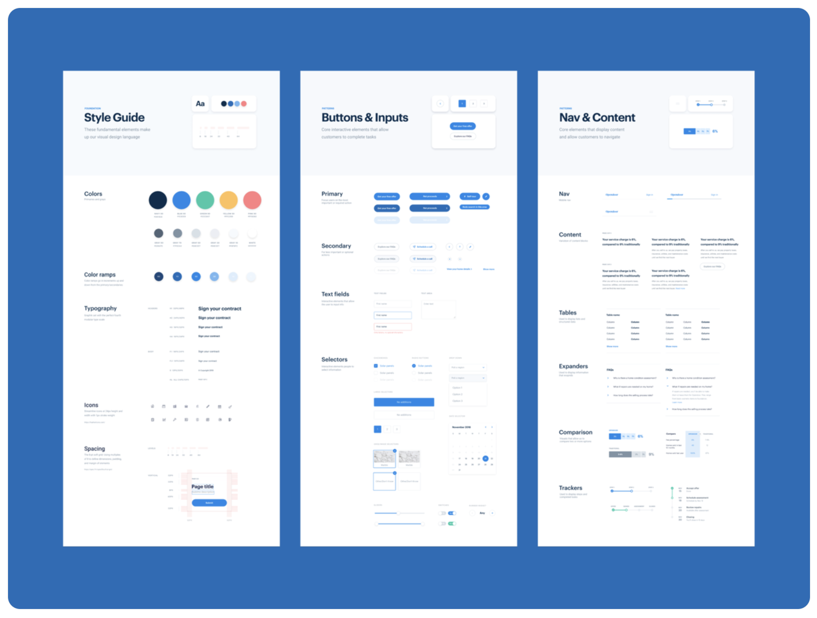
ODS v1 Consumer Design System by allen jordan for Opendoor Design
https://dribbble.com/shots/6419510-ODS-v1-Consumer-Design-System
Characteristics of a great UI Style Guide
Style Guides are more than documentation. They represent a base for design and implementation decisions that affect the Mobile App, not just in UI but also in UX. A useful Style Guide should be:
- Detailed and Informational. – Provide exact specifications and instructions for each element.
- Organized.- Keep sections, components, and details clear and grouped. Differentiate between the information coming from the App vs. the data to describe the parts of the App.
- Adaptable to future scenarios. – It is essential to consider future situations in the Style Guide, such as possible expansions of layouts or icon variations.
- Platform-specific. – The Style Guide should contain the graphics and components in the platform informational standards.
- Easy to use and understand. – The Style Guide needs to be accessible to all possible parties. The language used needs to be followed by product owners, designers, developers, and SQA Members.
- Updated: Keep your Style Guide up to date with the latest feature additions to avoid confusion for future releases.
Why are the Style Guides important?
- Evolution: It is essential to maintain a graphic coherence between current and future releases of the App, set the rules clear of how the screens are going to work, and how the development team should build each screen and how to use each component’s states, etc. It is also vital for the designer to be a little bit ahead of the possible scenarios and plan the UI in maybe not current but future situations that the development team may need.
- Internal or Third-Party Development: It is difficult and time-spending to reproduce high-fidelity mockups of all the possible scenarios and content of the App. Usually, all the situations take part in the Low – Medium fidelity Wireframes because they are easy to modify and track. That’s why it is crucial to establish in the Style Guide all the graphic variations of elements and components, that way, development teams will know the content of the screens based on Wireframes and how the App should look based on the Style Guide.
- Platform Differences: At this point, we have two scenarios: Mobile and Web.
- Mobile: Platforms like iOS and Android already provide a set of native elements and components. These elements will work with the intended design. It is essential to specify the variations that the Mobile App components will have (or not) in each platform.
- Web: For Websites and Apps, we also can find built elements and UI Web Libraries that provide already established designs. As designers, we have three options, we adapt the UI design to already set UI Libraries, or we adjust the UI Libraries to our UI design, or we create new elements and components. It doesn’t matter the option; it is essential to document the Style Guide’s design variations.
- Asset sharing: As we already established, high fidelity mockups may not contain all the possible scenarios and exceptions. For example, we may have an App of a device with ten different states represented in icons. It will be time-consuming to build ten different High Fidelity Mockups, so a solution is to create only one, but use the Style Guide to place the rest of the status assets.
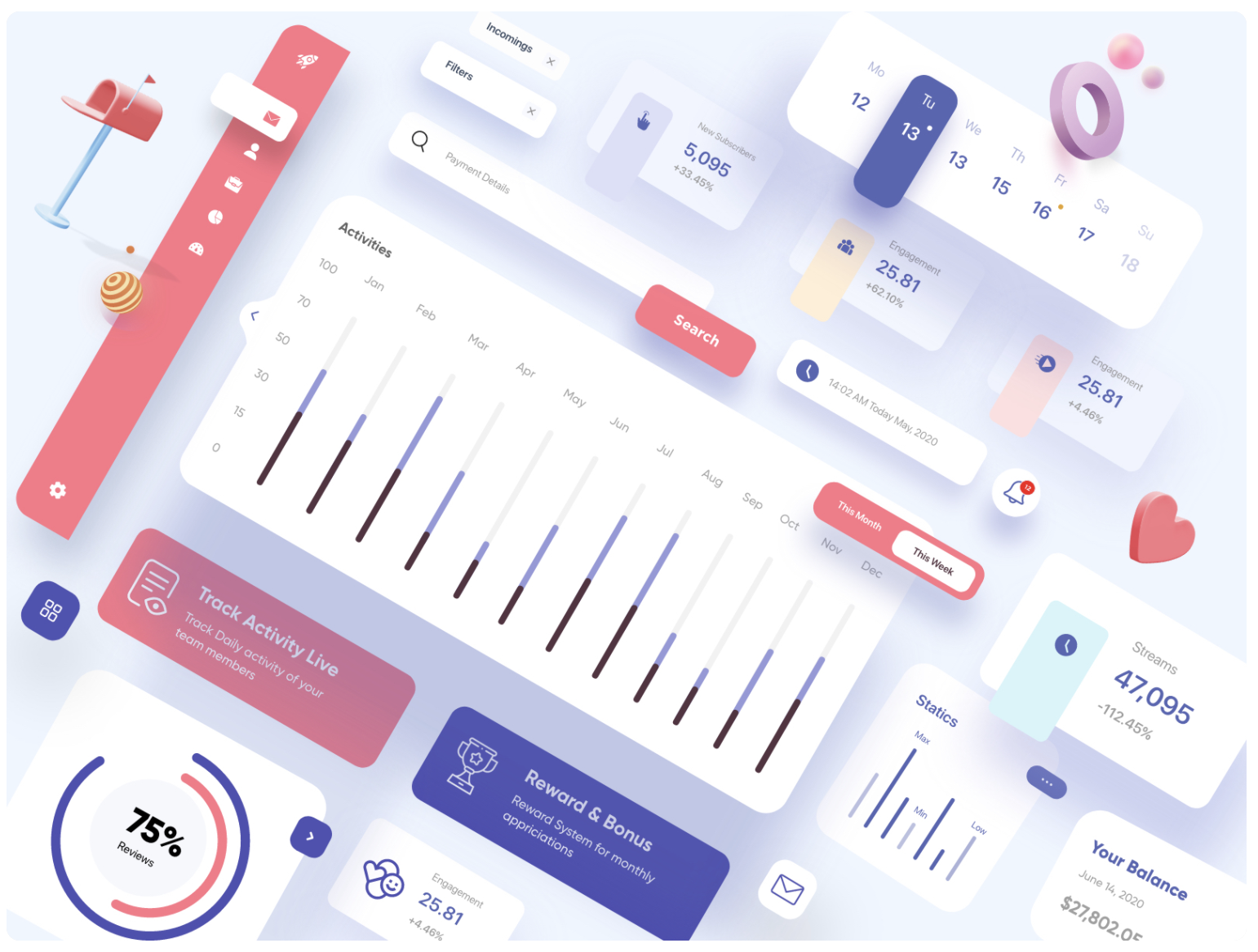
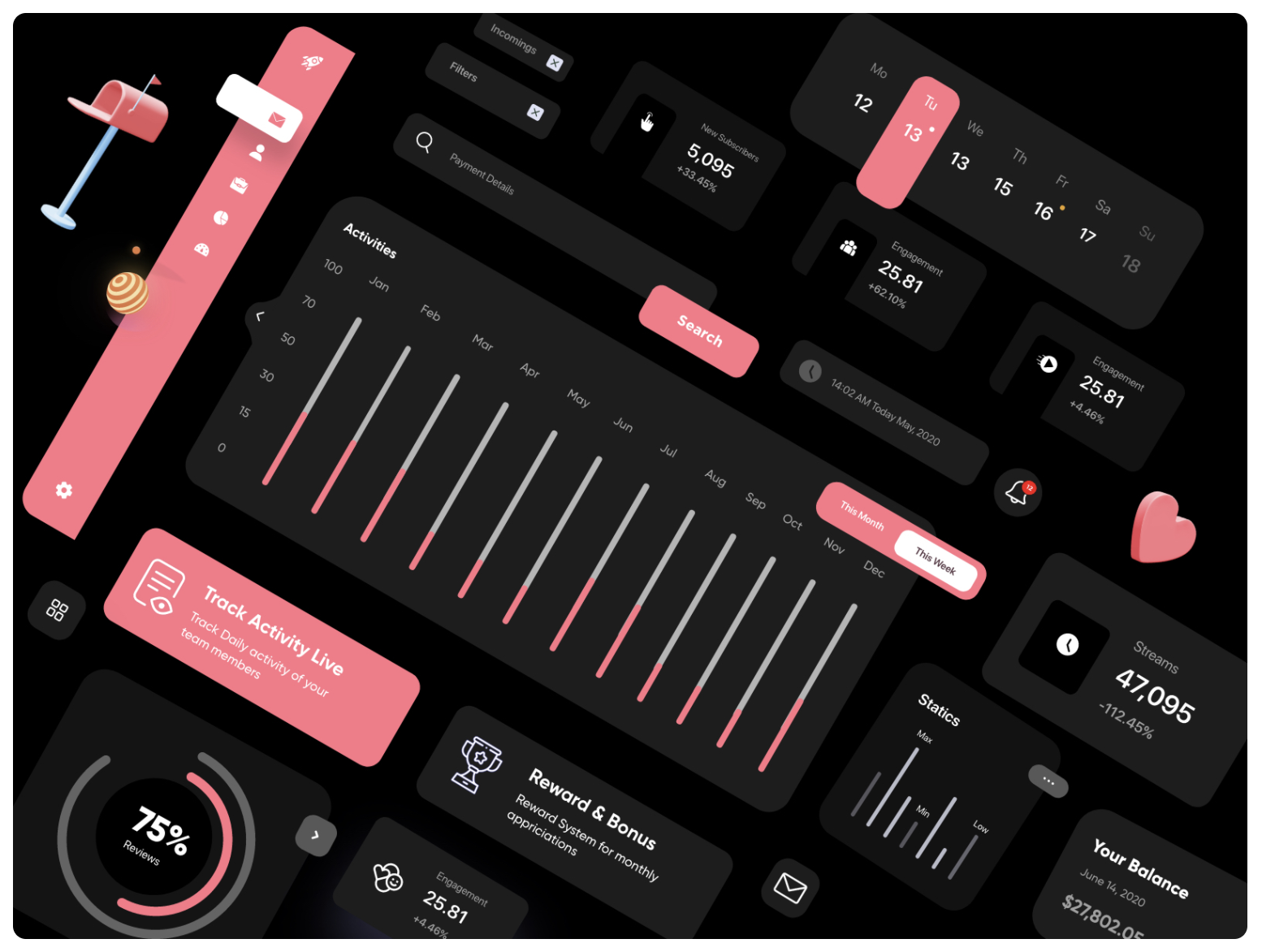
UI Elements / Light / Dark Theme UX-UI Design by Ghulam Rasool
https://dribbble.com/shots/12872837-UI-Elements-Light-Dark-Theme-UX-UI-Design
Interactive Style Guide.
We must build accessible and sharable Style Guides. The traditional way is to make a PDF with all the specifications, but this option is time-consuming. With the newest UI/UX software, we can create a Style Guide interactively and quickly to be latter shared with development and SQA Teams the information and details needed to build the App.
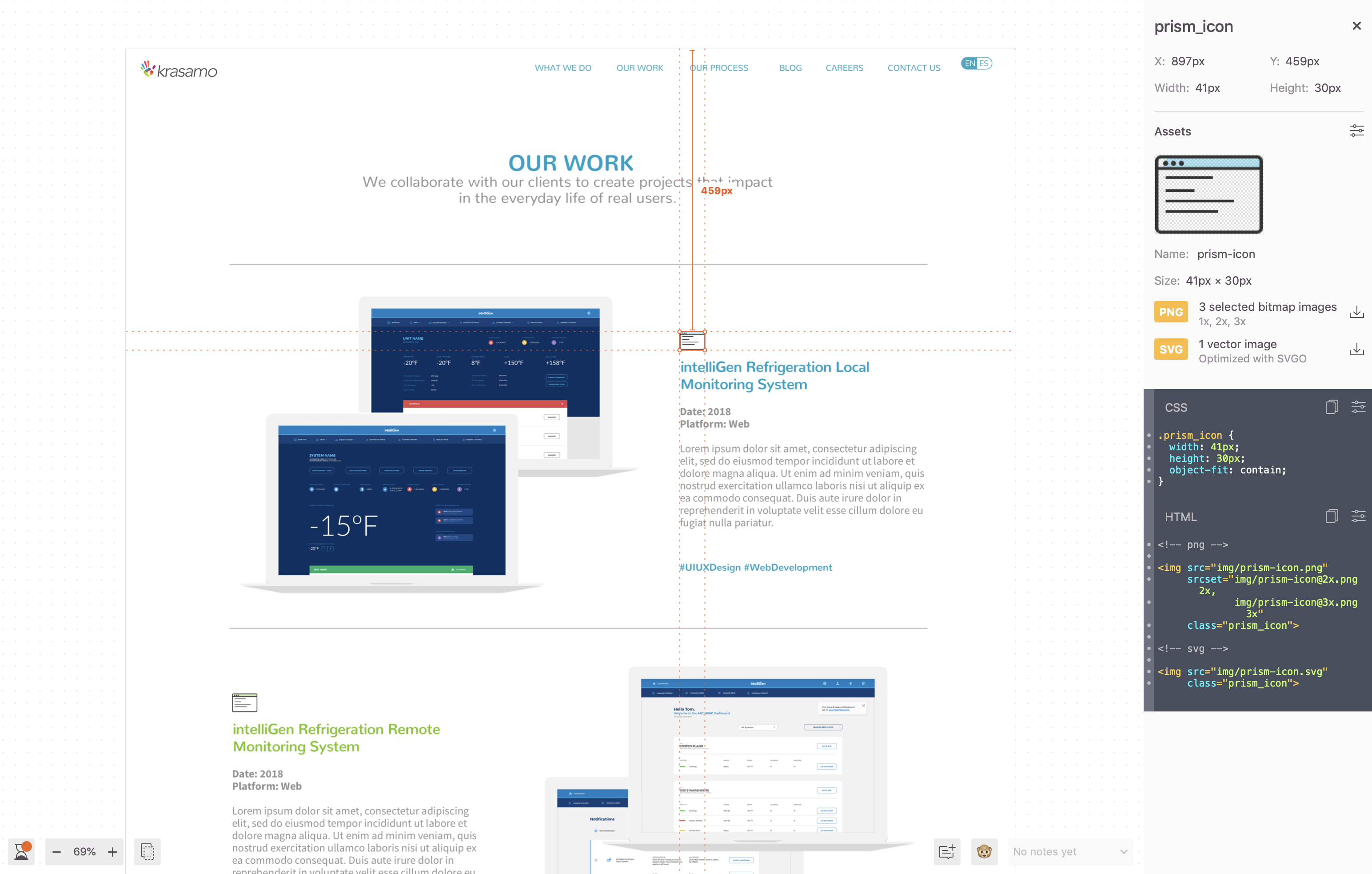
One example of this software is Zeplin. Zeplin is software for Web and Mobile Apps used to upload designs and share them with other teams or parties. Designers will upload their work into Zeplin, and Zeplin will translate the designs into essential information for the development and SQA teams.
This information includes values such as:
- RGB / HEX
- Sizes (px, dp, pts)
- Font Styles
- Asset Location
- HTML
- CSS
Even that Zeplin is used to share all aspects of the Mobile or Web Apps, it is an excellent tool to document and share Style Guides.
Zeplin Project. Krasamo Website.
What elements should you consider to build your Mobile App Style Guide?
- Fonts: Document all the possible variations of the Font Family within the mobile App, such as the used Font Style, usage situations, Font sizes, etc.
- Colors: We need to provide details about the RBG / HEX values of the colors and gradients. Also, if your App manages two UI themes (Dark – White) is essential to establish the rules for colors and components in both modes.
- Layouts: Distributions, columns, bars, and space management are characteristics of the details documented in the Style Guided.
- Graphics: Include all graphics, some of them may be interactive, some others may be static; such as:
- Icons
- Charts
- Animations
- Components: Components are essential in Apps. They are graphic the controls in the interface used to trigger desired actions and behaviors. Components may include:
- Button
- Slider
- Stepper
- Switch
- Dropdown
- Checkbox
- Text Field
- Calendar
- Segmented Control
- Tables
- Menus and bars: Within the platforms, we have set types of Menus and Navigation Bars, such as Tab Bars, Top Bars, Hamburger Menus, and others. Specify the usage of the different kinds of menus, how it looks like with one element, what happens if it hits 30 items, etc.
- Dialogs, Alerts & Popovers: Consider the technical and graphic aspects of dialogs and popovers. They may variate from each platform.
For more information about Components, you can visit our blog post about Mobile and Web Apps Component Glossary.





0 Comments