So, first things first. What is a Mobile App icon? The App Icon is a graphic that is used to identify a mobile app. Let’s consider that the App Icon is the first thing that the users will see in the App Store while choosing between a group of Apps of their interest. After the Mobile App is selected and downloaded, the App icon will still identify the Apps that the users have installed in their devices.
App Icons are necessary and mandatory to have to release a mobile App. Each platform has developed its own set of rules on how to build correctly the icon for it to work across different devices. For example, we can consider an App Icon that will have its presence from mobile phones to TV Apps.
What does it take to create a Mobile App icon? From a technical point of view, an App Icon is an asset. The App icon will need to be exported in different sizes that will be used for different platforms such as mobile phones, tablets, watches, or TV.
So, what characteristics or attributes can we work to ensure a good Mobile App Icon design? Here are some thoughts:
Do’s while designing the Mobile App Icon.
1. Use Branding Correctly
App Icons are not logos, but logos can undoubtedly be used as App icons. If you want to use a logo of an existing brand into a Mobile App Icon, make sure to gather the Branding Guidelines to ensure the correct use of the brand. If the Branding Guidelines allow it, be selective of what parts of the logo are put into the Mobile App (Sometimes logos are registered as a hole and the graphics cannot be separated, shown in parts or chopped). The main goal is to make the brand recognizable to the user directly and elegantly, always maintaining its essence. Colors are elements that users often use to recognize a brand. Colorimetry could be your best ally in the App Icon design when treating with an existing brand.
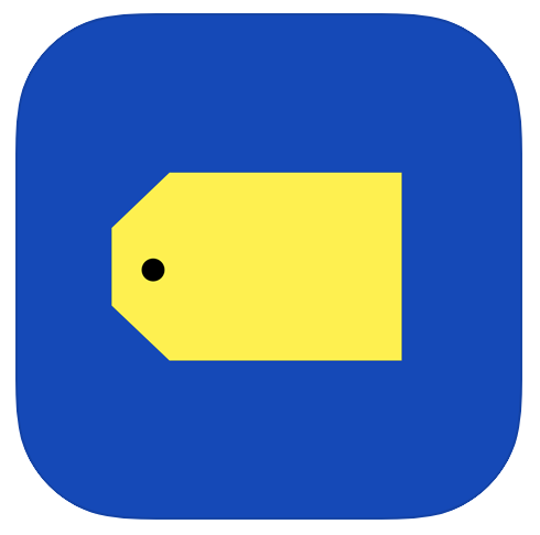
Example: Best Buy.
Best Buy logo has the characteristic that the tag that works as isotope is an excellent graphic choice for an App Icon.
2. Create a unique and recognizable symbol
If you are creating a new mobile App icon, the first questions you need to ask yourself as a designer are: what is the purpose of the App? How does the App accomplish its work? Answering this set of questions can help you organize and gather concepts that could work as App Icons. As designers, we can work these concepts and use them to create meaningful graphics or symbols.

Example: Facetune2.
The Facetune2 Mobile App Icon captures both concepts of the Mobile App’s primary purpose: the ability to modify attributes of photos of faces and the action itself of altering represented by a range and scale of a semicircle.
3. Consider your competition.
Your App will be sharing the same space with other Apps that maybe your competition. It is essential to make a graphical competitor analysis. If the functionality of the mobile App is similar is most likely that the same concepts are in use for the App Icon design. That’s why it is essential to create a graphic differentiator factor in the Mobile App Icon. This differentiator could be by color, shapes, visual style, etc.

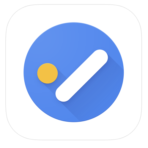

Example: Microsoft To-Do. Google Tasks. MinimaList
All three mobile apps share the same functionality. Each of them chose to adopt the same symbol, in this case, the checkmark. But all three decided to represent it differently by color and shape graphically. Even tho graphically are different, use the same symbol may not be convenient for a useful differentiation.
4. Be consistent with the App content.
Another element that can be used as inspiration while designing the App Icon is the Mobile App’s actual content. Sometimes, the UI of the Mobile App has unique graphic characteristics, taking these graphics as inspiration and use them to design the Mobile App icon is a good strategy because it gives the users the idea of what they will encounter when interacting with the App.

Example: Monument Valley.
The Design of the Monument Valley Game has been a key to its success. The Mobile App Icon’s design choice uses the main character of the game (Ida) and a context that appears in the game, such as vibrant colors, columns, and geometrics.
5. Know platform standards
It is essential to consider the design, the attributes, and restrictions for each platform. For instance, the area to cover with the design will be restricted by the shape of the Mobile App Icon, a square, a rounded square, a circle, or irregular forms and shapes. There are many blogs and sites with resources that can help you make the graphics for the mobile app icon. But there is always important to search and consult the platform guidelines:
iOS: https://developer.apple.com/design/human-interface-guidelines/ios/icons-and-images/app-icon/
Android: https://developer.android.com/google-play/resources/icon-design-specifications
6. Make it scalable.
Your design needs to be functional in a variety of sizes. If the Mobile App icon graphics are too complicated, they may be confusing to understand in smaller applications. The minor use of a Mobile App Icon is the Smartwatch, and the biggest use is TV apps. Your design will need to work on the range from the smallest to the largest.
7. Consider the Background.
For the App Icon to be recognizable and legible, it is essential to consider the background where it will be placed. But of course, that is not something that we have control of. The background of the App Stores could be either in dark mode or light mode. When the App is already downloaded, the background of the Home of the user’s device could be a photo, a texture, or a plain color. Try to test your design of the Mobile App Icon in as many backgrounds as possible to ensure its function.
Dont’s while designing the Mobile App Icon.
1. Try not to use words
Visuals are more attractive to the eye than texts. And when we have limited space as in the App Icon, usage of texts – words could be contra-productive. Also, consider the user of the mobile App and the language that it speaks, if you use words in the mobile app icon, it may not be understandable in some languages.
2. Try not to use photos.
For its nature, photos can be simple or complex, but the amount of information inside them makes them a weak element to use as App Icon. Also, items in a photo could not be understandable in small applications.
3. Do not make sudden design changes.
It is crucial that if the Mobile App is already in the market, design changes are gradual and consistent with what the user is used to see. Experimenting with sudden and completely different designs could confuse the user about what it is referring to.
To conclude.
The design of the mobile app icons could be as simple or complex as we designers want. The important thing is that our design is visible, recognizable, and coherent with the mobile App. Explore as many concepts and options that you feel are needed, test them, and improve your design. Have fun with the process.





0 Comments